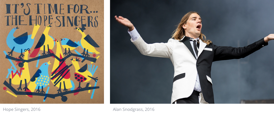
Like music, the fields of brand and graphic design are steeped in emotion, beauty and meaning. Where design differs from music however, is in its basis in function and practicality. People interact with design everyday and by providing them information, it helps in the planning and carrying out of everyday tasks. At times, design goes beyond the practical, helping in the understanding and interpretation of deeper lying messages (like personality, values or emotion). Well-considered album art, websites, posters, and even software are just a few examples of practical design pieces that people make deeper connections with.
But how is it that these connections are made? And in what ways can music and design work together to help artists reach their intended audience? In this post, we will start to explore these topics and discuss how taking time with design strategy and planning can aid artists in reaching and finding resonance with their audience.
Parts of the big picture
I’m a designer in my day job, and spend most of my time designing products and services for businesses and their users. With these projects, my job is to not only focus on aesthetics, but also to create things that help people to do what they need to do.Like most successful companies, ambitious artists and musicians need a well-thought-out design strategy and cohesive brand in order to reach the right market. Good branding encompasses several areas, and helps the audience to understand an artist’s values, what they trying to achieve and how they are going about it. Like it or not, branding can and often does have a big effect on how potential fans perceive an artist.To understand this topic, let’s first take a look at some basic branding elements. These may seem obvious, but what’s most important is to always consider these as part of the big picture. And while many design choices feel natural, or are self-obvious representations or extensions of your vision or personality (especially for creative types), it’s also good to think about how well they will resonate with your audience.
The building blocks of your brand will most likely include:
- Colour, imagery or font choices within artwork and other graphic design.
- Tone of voice and personality in interviews or on social media.
- Styling or dress choices in press shots or performances.

Branding an icon
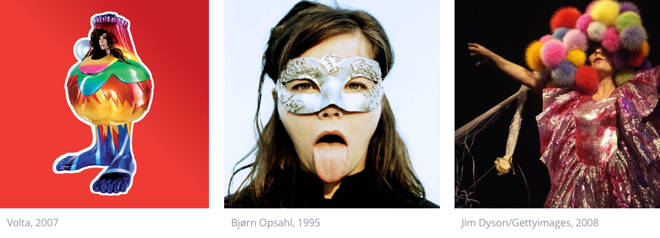
To illustrate how these elements can work together to form a cohesive brand, let’s examine how a widely recognised artist handles this topic. Icelandic singer Björk is an interesting example. Not only respected globally for her music, she is also seen as an innovator. Why do we perceive her in this way? Is it simply down to her music, or is there more at play? Let’s take a look at her branding using the elements outlined above:- Björk’s graphical design choices are distinct, unique and well-executed. Her album artwork is simple, eclectic and places her squarely in focus.
- Photography and press shots follow on from her album artwork in terms of their simplicity, and although she does show her eccentric nature, she also reveals a human side.
- Her costumes and outfits on stage and in the press are often elaborate and reveal her eccentricity, attention to detail and imagination.
- During interviews, she is frank and honest - if not a little prickly. She isn’t afraid to open up on the personal and societal topics she covers within her albums.
- She embraces new technology. Her 2011 album Biophilia was initially released exclusively via mobile app, and an immersive 360-degree virtual reality film clip was created for each track off her new album Vulnicura.

The combination of these elements create a strong, clear brand. As an artist, Björk is seen as an innovative, forward-gazing artist with strong human values. Strong brand design and strategy supports and furthers this, helping her to interact and connect with her audience on a meaningful level.
Björk’s may be an extreme case, but it helps to illustrate how the level of synchronicity between design and product - natural or meticulously planned - can create a cohesive brand.
Zooming in
What practical learnings can we take from the branding decisions of a global artist like Björk? The most important one involves having a clear vision for your project. Creating a vision starts by asking what story or message is at the core of the project, who the project is aimed at and how they will interact with it.When these questions have been answered, a cohesive design and brand strategy can be properly conceptualised. As a base, let’s expand on the brand elements that we discussed earlier:
- Tone of voice:
- How will you interact with your audience via social media?
- How will you interact with journalists and the press?
- Channels:
- What channels will you use to interact with your audience?
- What is the purpose of each channel?
- Is your brand represented consistently across all platforms?
- Graphic Design:
- How will various design elements work together to best communicate your vision?
- Do the font choices represent your voice and personality? Often overlooked, proper font usage will give your design a unique voice. Noupe has put together a handy beginner's guide to typography to start you off.
- Has colour been used appropriately? There is a science behind colour interpretation. Colour Meanings is a resource that explains how people perceive colour across industries and cultures.
- Is your vision best represented with photographic or graphical elements? Do your audience want that glossy photo of you and the band, or would they respond better to something more indicative of the music, sound or culture?
- How can you best get your audience’s attention?
- Like Björk, will innovating technologically garner attention? Or would collaborating with other artists or local institutions get you further?
One last thing
As a final note, it’s important to remember that art is ever changing. Although a consistent brand is desirable, this concept is not static. Times, trends, music and audiences all change. Taking time to re-centre around vision and audience will ensure the relevance and quality of your brand and music.
Ready to get your music out there?
Distribute your music to the widest range of streaming platforms and shops worldwide.


