In this era of short attention spans and quick thrills, it’s easy to imagine how something like album artwork could be overlooked or underestimated by a musician. Where once we were able to appreciate the glory of tasteful album art in its primal, physical form, listeners now mostly enjoy their favourite band’s album artwork through a screen, in digital format. There, releases vie for attention with a dizzying, unprecedented number of challengers. A click to preview, a scroll to dismiss - what’s the point in spending time or money on anything else other than the music itself?
Well, therein lies the answer. Shortening attention spans make it ever more important for an artist to take care of the visual aesthetic of their work. In an endlessly scrolling list of musical choices, the stakes are high. Which release will be the one that grabs a listener’s attention?On the surface, creating artwork for release on digital platforms seems straight-forward, and in many ways it is. Where once vinyl and CD’s came with front & back covers and mini booklets, most releases nowadays (the ones that cater for the likes of Spotify, SoundCloud, or iTunes) utilise only a single, square image. But while it might be true that this task is simpler in regards to the amount of work required, creating a piece that not only grabs attention quickly, but also represents your brand and your music is a challenge not to be sniffed at.So where to start? The good news is that shortening attention spans bring new trends and stylistic inspiration. Minimalism is in vogue. This doesn’t necessarily mean that creating impactful artwork becomes easier - but it may make it less intricate.As I outlined in my previous article, there are several base elements at your disposal to help you communicate your vision, and help you create striking, effective, aesthetically pleasing artworks. This time, I’ll go into more detail with each of these elements, providing examples of recent artworks that I think showcase them well.
Colour
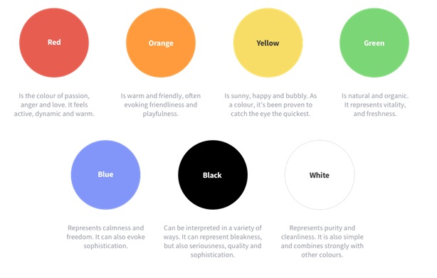
As a designer, I’ve been - on occasion - branded as a glorified colour-picker (something I would of course wholeheartedly refute). But colour selection is no trivial matter! It is an incredibly important process for any brand. Think about Coca-Cola and it’s red, Starbucks and it’s green, or Prince and his purple.Taking the proper time to select a colour palette for each release is highly recommended. Colours have the potential to evoke strong emotions, and will help to add depth to the audience’s perception of your music. Let’s look at some high-level colour semiotics to get you started. What is the story of your release? Translating stories, emotions and inspiration into colour is just as intuitive a process as creating music. Working with colour correctly can help your audience to understand your music before even listening to it.
Here are some recent examples of great, evocative colour usage in album artwork.

Ready to get your music out there?
Distribute your music to the widest range of streaming platforms and shops worldwide.


